

TLDR; I made a Day/Night HTML toggle button (with no JavaScript)
How It Started
Last night a friend sent me a link to a funny post on the r/ProgrammerHumor subreddit showing the "expectations vs reality" of designing a unique Day/Night toggle button (see below)
Design vs Programming.
We've all been handed an 'impossible' mock-up from time to time, but that post really shows the sweat dripping stress and frustration you'll go through to achieve perfection. I've been in that dev's shoes way too many times 😂
But after re-watching the video a few times, I thought "Wow... that's actually a kinda cool design. I wonder how it would be to make it real? 30... maybe 40 minutes tops???" Meanwhile, the sensible part of my brain was kinda like Michael from The Office:
The Design
I figure I'll draw out a rough design of how it could be done and see if it's even worth the effort.
So I came up with this (Click to Enlarge)...
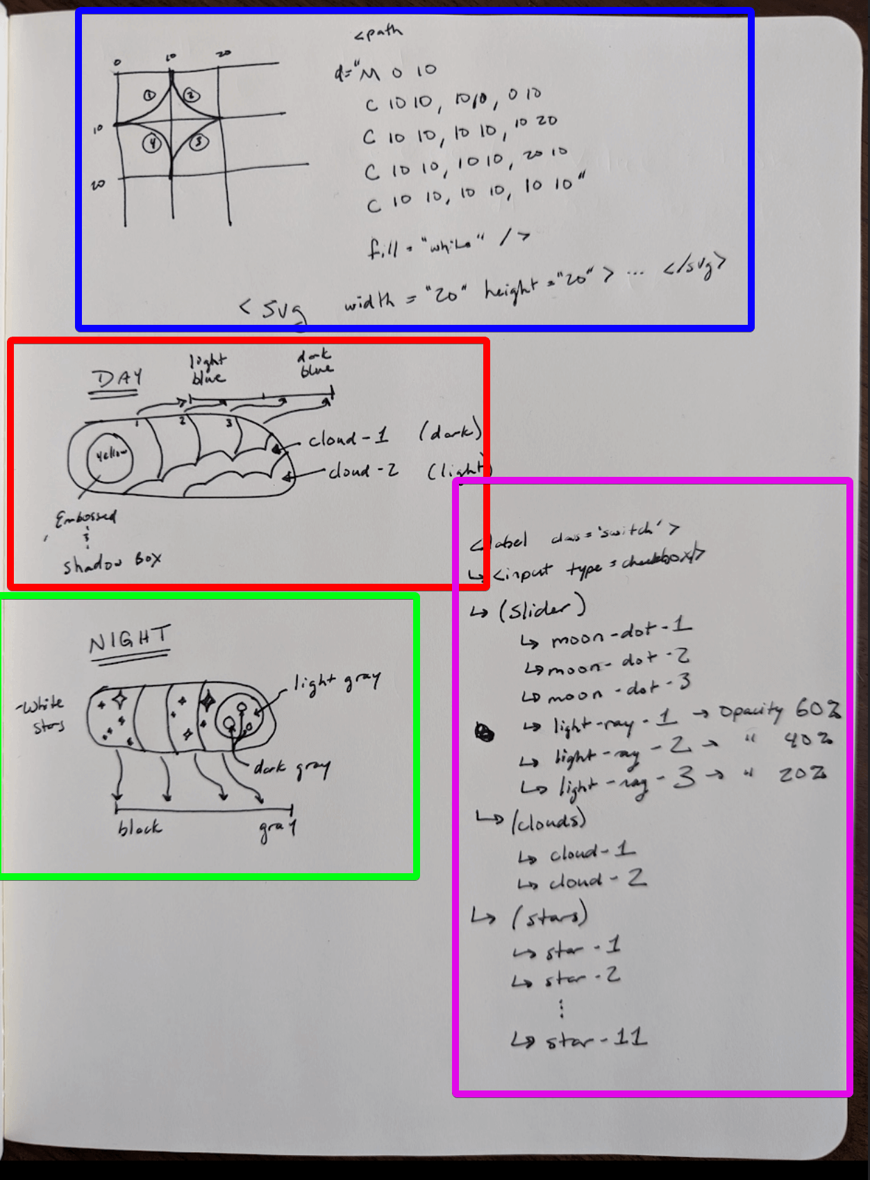
Here's a breakdown of what's on the page:
-
In BLUE, I wrote down how you could make a 'star' with only SVG paths.
This led me down a rabbit hole of
learning how SVG paths work and doing it myself
Spoiler alert: I was close in this design, but not 100% correct (Bonus points if you can catch what's wrong with my hand-written Bezier curves & SVG path) - In RED, I drew out what the "Day" toggle of the button would be. I wanted to write down everything in the video, so I didn't have to keep watching it frame-by-frame anymore 😫
- In GREEN, I drew out what the "Night" cycle with stars and the moon
- Finally in the MAGENTA color, the HTML components hierarchy is vaguely written out
This design/whiteboard work took me ~30 minutes and gave me the confidence that this thing was possible!
The Implementation
Where to start with a project like this? Easy, a W3 schools tutorial page for "How to make a Toggle Switch" 👍👍!
Cool, so ripping out that code and dumping it into CodePen completed. Now started on the Sun/Moon, and did the following:
-
Replace W3's use of
::before in CSS with adiv for the circle in the slider -
Update the slider background colors to
blue andblack -
Update the circle in the slider to
yellow andwhite -
Add 3
SVG circles
for the craters of the Moon (with the correct z-index).
Fun Fact: Setting thez-index of an element won't work if it hasposition: absolute and the parent doesn't have an explicitz-index . So be sure to set.slider { z-index: 0; }
Next up, adding the "light rays" and the clouds:
- For the light rays, I added 3 circles with each circle slightly larger than the last and centered behind the circle
-
Fade the light rays out the further they are from the circle with
opacity: 10% . Originally, I had decremented the opacity values the further they were, but I realized that opaque white circles stack 😛. - For the clouds, my thought was to just add a bunch of circles that I'll overlay on top of one another. There would be 2 sets of clouds, the darker ones in the back and the lighter ones in the front.
-
Both the clouds and light rays are "child elements" to the
sun-moon div , and this allows them to translate to the right "with the Sun" as the switch is toggled
Okay, moving onto the stars. Now I had manually written down what an SVG of a star could look like, but when I tried to turn that pseudo-code into reality, this is what I got:
As you can tell, it's not the 4-pointed star I was hoping for, but rather a star with its head cut off 😕. So what went wrong? Well, here's what I found:
-
The ending position of the 4th Bezier curve was in the wrong location:
C 10 10, 10 10, 10 10 ->C 10 10, 10 10, 10 0 -
The path wasn't being closed, so appended a
Z to it - The first curve needed to be repeated at the end (unsure why or how I figured this out... 🐰🎩)
So how's it looking?
Great! Okay, now adding a few copies of this SVG to the "Moon" part of the toggle (translating down from above as the input is checked):
Woot, we're techinically done 🙌🎊🎉! But it feels like there's something missing... What if we added some animations???
Let's add the following:
-
Animation for clouds moving left and right
@keyframes cloud-move { 0% { transform: translateX(0px); } 40% { transform: translateX(4px); } 80% { transform: translateX(-4px); } 100% { transform: translateX(0px); } } -
Animation for the stars to grow and shrink, e.g. "Twinkle"
@keyframes star-twinkle { 0% { transform: scale(1); } 40% { transform: scale(1.2); } 80% { transform: scale(0.8); } 100% { transform: scale(1); } } -
Add the animation to the stars/clouds on an infinite loop (duration can vary):
animation-name: star-twinkle; animation-duration: 2s; animation-iteration-count: infinite; -
Give some uniqueness the animation by adding differing
animation-delay to each star and set of clouds
Conclusion
This was a fun little project and "only" took 2 hours 😅. It's not exact to the design from the original video, but I think it looks pretty good for the size of the button.
I definitely learned some things about SVGs and CSS along the way, so hopefully I won't be stopped by the same roadblocks in my future projects.
Best,
nv
Writer's Note
I wanted to challenge myself to work on a few things for this blog:
- Embedded running code (Codepen)
- GIFs / Narrative story telling
- Embedded video
- Add emojis (I'm using the Emoji VSCode plugin)
I'm hoping to build on each subsequent blog to write more engaging content. So please bare with me as each post is hopefully better than the last 😃